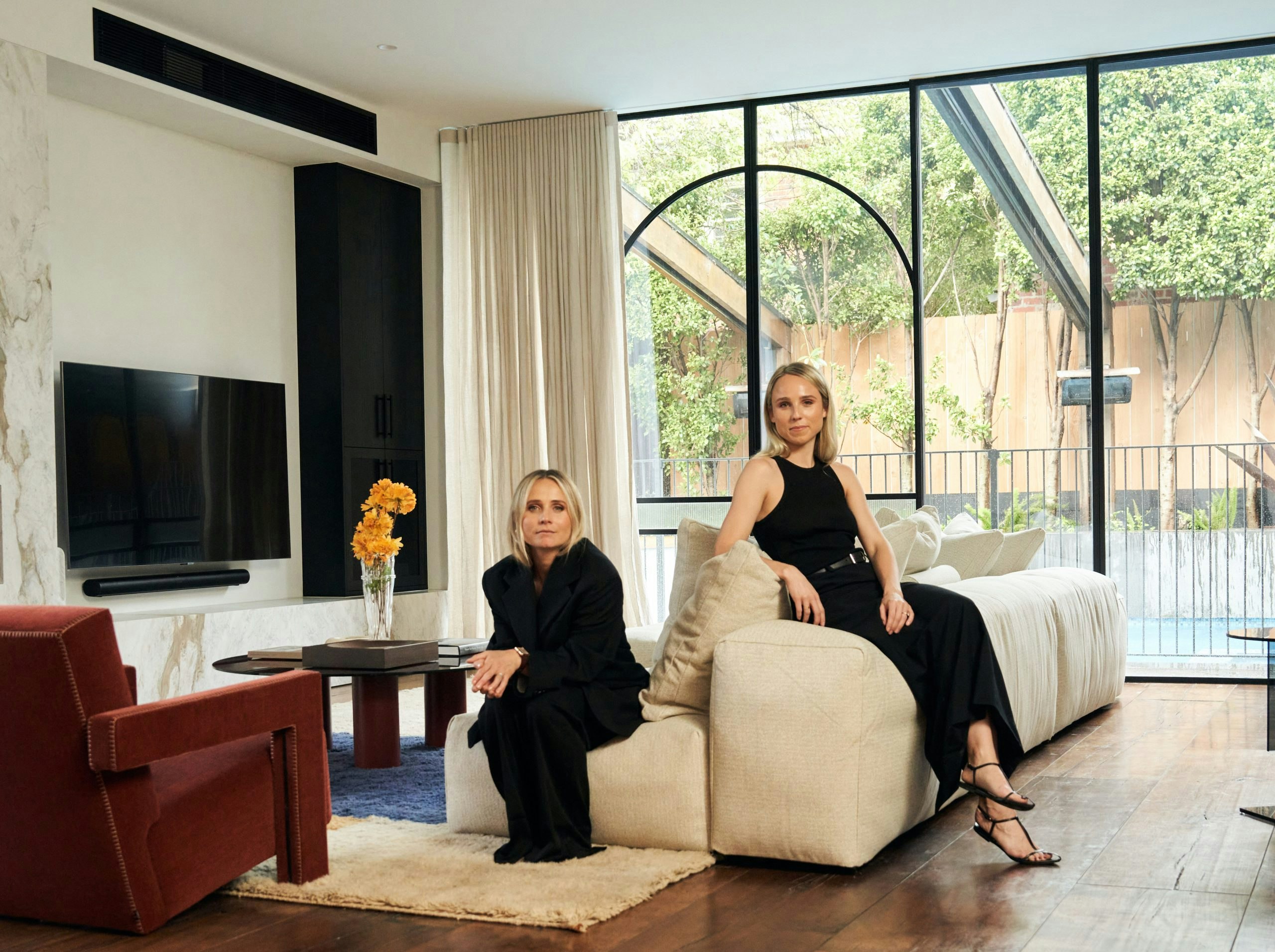
Clients often come with a desire to imbue their spaces with both a sense of history and modernity. Consider the elegant spaces of the Victorian era, reimagined with today’s stylistic tastes. Traditionally, such rooms were designed to impress, adorned with elaborate details like ceiling roses and deep cornices. The challenge today is to recreate this grandeur while aligning it with modern sensibilities and uses.
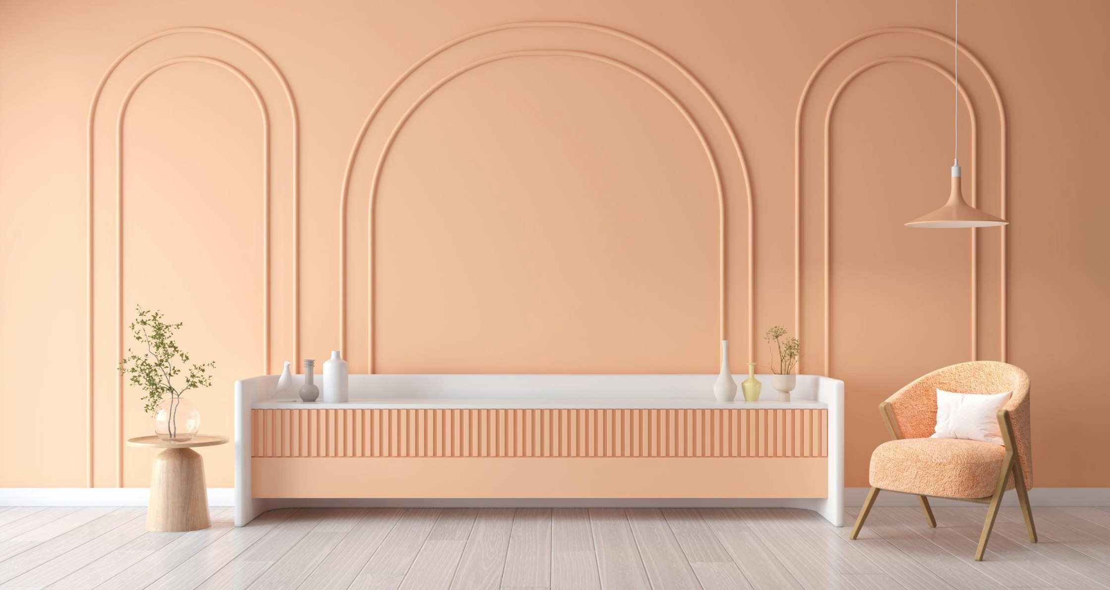
The secret lies in colour. Colour schemes not only connect different elements within a room but also tie together distinct rooms, creating a seamless and cohesive flow. For instance, the use of deep, rich colours can immediately evoke the Victorian period’s luxury and depth. Paired with modern elements like velvet drapes and vintage chandeliers, a space can transport you back in time while keeping one foot firmly in the present.
When working with colour, the key is to be intentional. Bold colours, when used thoughtfully, can be transformative.
They should resonate with the room’s intended mood or echo elements like a piece of art or fabric. Artwork can inspire a colour palette that is as bold as it is playful, setting an energetic tone throughout the space.
It’s essential to understand that in colour theory, balance and harmony are paramount. Colours can contrast or complement each other, and multiple hues can coexist as long as they maintain a conversation within the space. It’s about matching tones in a way that they subtly interact and balance each other out. An adept designer knows how to use colour to create layers, adding depth and dimension to a room.
For instance, in a wine room, the subtle relationship between pink velvet lounge chairs and a pink mirror might not be immediately apparent. However, this connection through similar colour tones adds a layer of sophistication and balance, contributing to the room’s overall ambience.
The use of colour in interior design is a journey of creating and telling stories. It’s about understanding the past, embracing the present, and foreseeing the future. It’s about crafting spaces that are not just visually appealing but are emotionally resonant. As designers, our role is to interpret and translate the client’s vision into a language of colours and tones, creating spaces that are not only beautiful but meaningful. The right colour palette doesn’t just decorate a space; it brings it to life.
To discover more, tune into AKI Design’s upcoming segment of our exclusive “Collective Conversation” video series, or visit the below websites.